|
This FAQ started when I began to research the well-known but hard-to-get Feinen font. I found so much of interest that I thought I might as well make it into an FAQ - expanded to include not just Feinen but all the other OD&D/Mystara fonts too. The info is really coming together now, though it is still a fair way from being complete.
Mystara Font FAQ
Fonts have an amazing effect on us. Just by using a certain typeface, text can become familiar, friendly and even nostalgic. Of course, we tend to favour the typefaces we know, and make associations based on the things we know them for.
In D&D, quite a number of highly original fonts were used over the course of Mystara's time in print, as well as some quite normal looking ones. But make no mistake, pretty or plain, those fonts are sure to be lodged in your head! For most of us, they are strongly connected with the Known World, OD&D, Mystara, and so on.
But what are these fonts? Most of us know only about the fabled "Feinen Bold", but surely there are many other fonts that could be chosen to represent Mystara; after all, Feinen was never a font used for bodies of text.
This FAQ sets out to explain this question by identifying which fonts were used where and on what products. It is likely to be a work in progress until we can get first hand confirmation of which fonts were used - which seems rather unlikely at this point.
Clicking on a font's name will take you to that font's page at Identifont. For details on the methods used to identify the fonts, please look at the bottom of the FAQ.
The List
In very rough chronological order of use. (That is to say that they should be ordered that way... in theory... when I get round to it!)
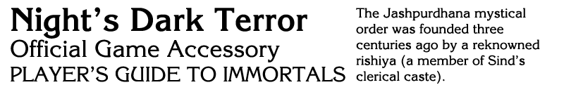
Quentin EF (Elsner+Flake) - Original D&D logo. Characteristics: fancy-looking serifs at the top, middle and bottom of each character.
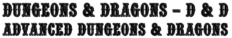 Quentin EF (customised) - D&D logo from the 1981 Expert Set up until the arrival of the Rules Cyclopedia. An adaptation of Quentin EF, with the serifs in the middle of each character taken out. The quite-obviously-customised ampersand appears to have been introduced with the 1983 Basic Set. Characteristics: fancy-looking serifs at the top and bottom of each character.
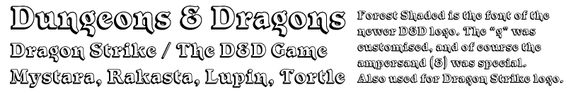
Forest Shaded (ITC/Letraset) - D&D logo from Rules Cyclopedia to the end of the product line. This version is quite different from the older logos, with a new font, capitalised words instead of all upper case, and a new version of the customised ampersand. Characteristics: very unique-looking "g" with a customised open tail; "n" has an extended tail; the bar of the "e" is angled, while the counter of the "o" is angled in the opposite direction.
Quentin EF (customised) - D&D logo from the 1981 Expert Set up until the arrival of the Rules Cyclopedia. An adaptation of Quentin EF, with the serifs in the middle of each character taken out. The quite-obviously-customised ampersand appears to have been introduced with the 1983 Basic Set. Characteristics: fancy-looking serifs at the top and bottom of each character.
Forest Shaded (ITC/Letraset) - D&D logo from Rules Cyclopedia to the end of the product line. This version is quite different from the older logos, with a new font, capitalised words instead of all upper case, and a new version of the customised ampersand. Characteristics: very unique-looking "g" with a customised open tail; "n" has an extended tail; the bar of the "e" is angled, while the counter of the "o" is angled in the opposite direction.
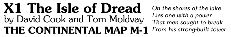
 Souvenir (Adobe, Linotype) - Used on X1 (1981) maps (Demi), B3 (orange)/B4/X1 (1981)/X2 cover titles and text, X1 (1981) to X5 interior text and headers, ... . Characteristics: Distinctive "rounded" feeling. "J" sits on the baseline.
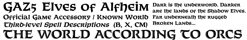
 Korinna (ITC, Adobe, Linotype, Elsner+Flake) - All text on the Basic, Expert, Companion, Master & Immortals Set covers; most cover text on B5 through B12, B1-9, BSOLO (though the title itself is a different font), X3 through X13, XL1, XSOLO1 and XS2, MSOLO1 and MSOLO2, O1 and O2, all CM, M and IM modules, the DA series, the DDA series, the AC series (except titles on AC1 and AC4), the Hollow World series, and the Trail Maps. Used later on for maps in Dragon and Champions of Mystara. Characteristics: M with sloping sides, N with elevated middle bar, "bulging" U, C and G.
 Baskerville - BECMI text, and most module and accessory text up until the Gazetteers. Closest match so far is Baskerville BT. Usage of italics in the texts includes both proper italics and faux italics. Characteristics: Q with double sided tail, J extending below baseline, 2, 3 and 4 are distinctive in style. Ampersand ends in a flourish, percentage sign has a link between upper circle and slash.
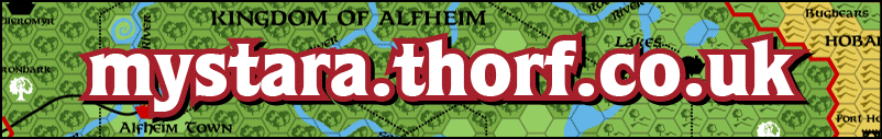
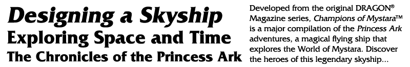
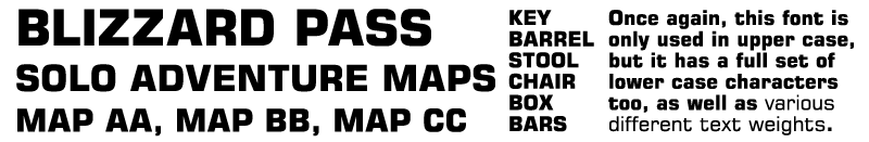
 Feinen (Datascan) - Gazetteer series titles and headings, as well as maps; PC series headings and maps; Wrath of the Immortals maps; TM series maps; Rules Cyclopedia maps (except world maps); Hollow World series maps; DDA series maps; various other maps. Usually appeared in bold, sometimes inline (e.g. GAZ10's map). Characteristics: Celtic-looking font. Also available as OPTIFurst (OPTI/Castcraft Software), and Baldur (Mad Irishman Productions).
The only officially confirmed font, and the most expensive one to obtain.
 Garamond - most text from the Gazetteer series and onwards, including the PC series, Hollow World series, Rules Cyclopedia, Champions of Mystara, Wrath of the Immortals, etc. Exact version unconfirmed; example is Garamond LT. This may not be a perfect match, but it's extremely close. At first I thought this was Garamond #3, but the Poor Wizard's Almanacs show us an italic ampersand (a wonderful gift for trying to match the font), which makes me think that it is a different type of Garamond. However, there may in fact be various versions in use considering how many products are involved. Characteristics: W has four upper terminals, J extends below baseline.
 Friz Quadrata (ITC, etc.) - Champions of Mystara and Poor Wizard's Almanac headings. Champions of Mystara cover subtitles look similar, but not identical. The style used is probably bold. Characteristics: smart looking characters with very subtle serifs. Reminiscent of Star Trek.
 Optima (Adobe, Linotype) - PC series cover title and text, and Poor Wizard's Almanac I & II cover blurb. The Almanac cover text looks slightly stretched vertically, and the example image here has been similarly formatted. Zapf Humanist 601 (Bitstream) is another candidate, and seems identical to Optima. Characteristics: a thin, condensed non-serif font.
Note that Optima is included with Mac OSX.
 Quorum Black (ITC) - Headings in the Rules Cyclopedia, and headings and book subtitles in Wrath of the Immortals; cover title and text for DMR1. Characteristics: heavy font with subtle serifs.
 Quill (Monotype) - Companion and Master Set world map and illustration labels.
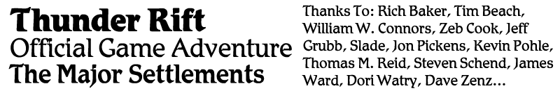
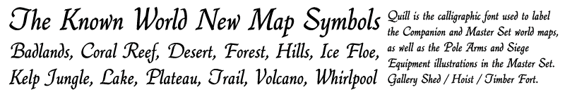 Schadow Antiqua (URW) - Thunder Rift and Entry-Level product line cover titles and content page text; B7 wine label names and "Winery" text. Romic seems to be identical to Schadow Antiqua. (Example is Romic.)
 Vivaldi (Linotype) - B7 interior title and some headings, including map and appendix headings. But note that some characters (notably the "h" in "Rahasia") may be customised or alternate glyphs. Characteristics: highly calligraphic capitals.
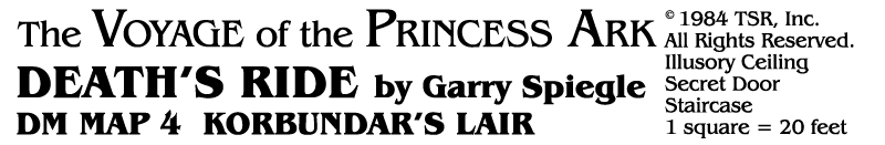
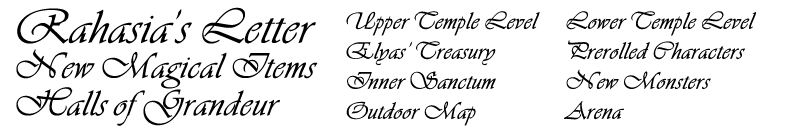 Libra BT (Bitstream) - Poems and letter text in B7, chapter headings in B11 and B12, mission statement text in the Princess Ark series, section headings in Thunder Rift/Entry Level series. (Thanks to the TSR & WotC Font FAQ for this one!) Characteristics: another Celtic style font, with only lower case characters. Capitals can be simulated with varying font sizes.
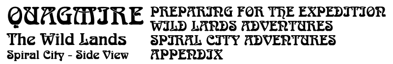
 Arnold Boecklin (Adobe, Linotype, URW) - Headers in X6 Quagmire. Characteristics: organic-looking font.
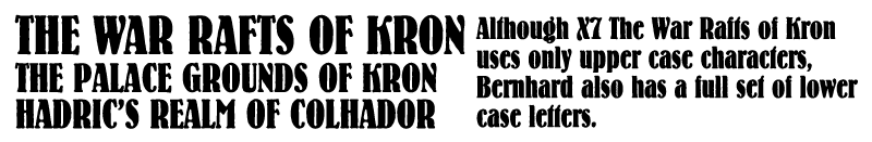
 Bernhard (ParaType) - Headers in X7 The War Rafts of Kron. Characteristics: heavy-faced font with interesting serifs.
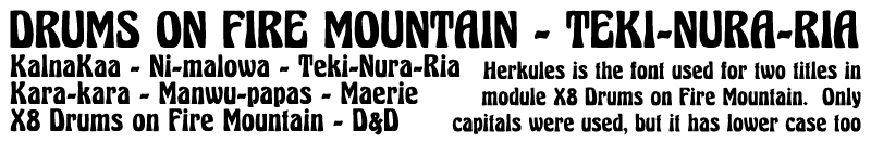
 Herkules (Unknown) - X8 interior title and inside cover map title. Characteristics: letters are all the same uniform size, as if they were drawn within an upright rectangle, with squared off outer edges but curves inside.
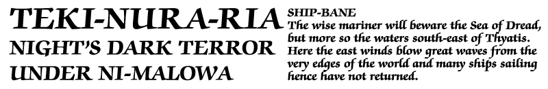
 Zapf Chancery Roman Bold (ITC) - B10 interior title and X8 section headings. Characteristics: very readable Times-like font with large serifs.
 ITC Bookman (ITC, Elsner+Flake) - AC4 title, headings, and indeed all interior text. Various styles are used. The M and G in the title are from ITC Bookman Swash. Characteristics: very distinctive Q, with a full loop for the tail.
 Square 721 BT Bold (Bitstream) - Map labels in MSOLO1. This font doesn't seem to have many distinguishing features, other than the square design of all the characters. It could also be Eurostile Heavy, which seems similar or identical to Square 721 BT.
 Benguiat Book - Title for the Voyages of the Princess Ark series. CM2 booklet title and map titles. Characteristics: very similar to Korinna, with a unique-looking N, but serifs are different, as is the A. For a long time I thought this font was Korinna.
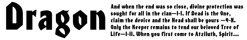
 ITC Honda - Tablet inscriptions in CM7. Also Dragon magazine logo. Characteristics: Fraktur-like qualities, with very angular strokes. Note that there are two versions of the Dragon logo using this or a very similar font: the older version has a more angular "a", while the newer version matches Honda's curved "a". Another as yet unconfirmed similar font is Heidelberg.
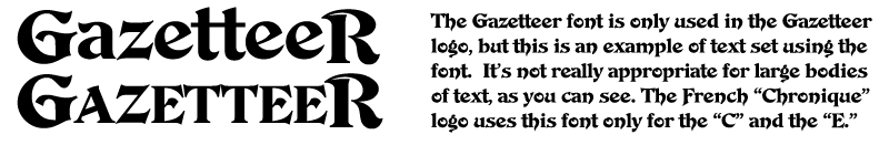
 De Vinne Ornamental (Linotype) - Gazetteer logo. The letters in the logo are not completely identical to this font, but it seems likely that the logo was based on De Vinne. (The top and bottom serifs from each letter are missing.) The French Gazetteer logo "Chronique" appears to use a very similar font for at least some of its letters (the C and E), but others look like a different font altogether.
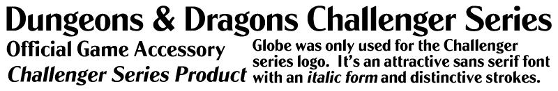
 Globe (URW) - Challenger series logo. Characteristics: distinctive angled top on lower case l, m, n, r, etc. Angled lower case e. Two storey g with disctinctive-looking open loop.
 Century Schoolbook (Monotype, Adobe, URW, etc.) - Dungeon magazine text and map labels font.
 Pretorian DT (DTP Types) - Dragon Quest board game logo.
Fonts left to investigate: Hollow World logo, Champions of Mystara title, CM4 handout text, Poor Wizard's Almanac title.
Research Methods
The first stop for anyone interested in fonts used in any edition of D&D or AD&D is of course the TSR WotC Font FAQ. This is a great page, but it is unfortunately somewhat lacking in details when it comes to OD&D and Mystara. Nevertheless, it has invaluable information on Feinen, as well as Quentin EF, which would otherwise have been difficult to come by.
This still leaves a great many fonts unknown. Thankfully, for this we have Identifont, a site that allows you to search for unknown fonts simply by answering a series of questions.
Identifont is an extremely powerful resource, because it performs the very important task of narrowing down our search range to a manageable number of fonts. There are some problems when we only have limited examples to go by - in the case of the newer Dungeons & Dragons Challenger Series logo, for example - and it is easy to introduce user error into the search by answering a question wrongly, but these are problems that we can work around.
Information on Obtaining Fonts
Under Construction
Feinen
Feinen was the font used for the titles and headings of the majority of OD&D products, most notably for the entire Gazetteer series. Additionally, it was the standard font for mapping until Korinna took over (first in Dragon, later in Champions of Mystara too). As such, all of us who know Mystara tend to associate Feinen with our world.
The version apparently used in TSR products was Feinen Bold, made by a company called Datascan. (See the excellent TSR & WotC Font FAQ.)
There are apparently two other versions, known as FC-Feinen (company unknown) and Furst, aka OPTIFurst (made by OptiFont/Castcraft Software). I have seen Furst firsthand, though I do not own it. Furst Bold is indeed very similar to Feinen.
Finally, there is a cloned version of Feinen, known as Baldur. It's made by Mad Irishman Productions, and you can buy it at myfonts.com for a mere US$12 or so. The current version does not include accents, but a new version is going to be released soon which includes both accents and some special characters like Cyrillic. (I have a beta version, which is how you can see accents on my maps already.)
|